How To Size Images For The Web
Sizing images for the web can be hard, especially working in an agency that specializes in branding services and wants to show off their work in the highest quality possible. As a tech SEO, I’m always looking to improve a website in as many ways as possible and one of those ways is improving website loading times. The faster the page loads the better the user experience and the higher the chance that they will take an action that we want them to. For example for an eCommerce site, this could be purchasing a product, for an agency it could be someone filling out a contact form or for a blogger that could be reading another post. Whatever you want the user to do next, site speed will always play a part. When it comes to images I try to make sure they’re always less than 100kb.
How Do Images Play A Part In Site Speed?
Images tend to be the largest files on your website that the user has to download. Generally speaking, the smaller the file size, the quicker it downloads, the faster the page loads for the user. If you’re at home sitting at your desktop or browsing the web on WiFi then this isn’t something that you notice as your internet speed is fast enough to quickly download and display these images. However, if you’re on a slow connection, be that 3g or slow rural broadband, you can quickly notice a webpage loading slowly and the chances are you give up after a few seconds and head back to the search results to find another website that will load quicker.
To demonstrate the impact of large images on a website I like to head into the browser dev tools and simulate how the website loads over a slow connection. This quickly illustrates the importance of correctly sizing your images.
How To Choose Image Dimensions?
When choosing the dimensions of your image (width x height) you have to bear in mind where you’re using the image, what purpose the image serves and how large it’s displayed in the browser.
Hero Image
If you’re using the image as a full-width hero image like on the site below
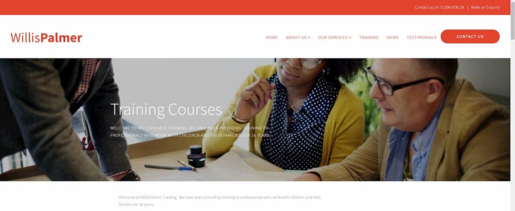
then your image needs to be quite large to make sure that it looks high quality and isn’t pixelated. If this is the case for your site it can be helpful to once again head into your browsers developer tools to see what dimensions the hero section is being displayed at.
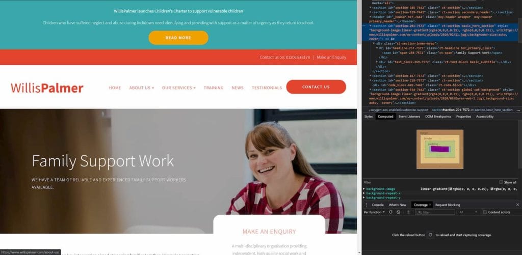
In our example above, you can see it’s displayed at 1330x460 px. While this isn’t a perfect way to find out what dimensions your image should be it does give us a rough idea of where to start. As we’re seeing the dimensions our browser is displaying the image at, it will differ for different people due to their screen resolution, scaling settings and as we have the developer tools open it also reduces our width and height.
Post/Page Image
If you’re adding an image to a post or page of your website then you can usually choose a standard dimension such as 1200x800px for all of your images and be pretty confident that you’ve struck a good balance between the quality of your image and the final file size of it. This is a good rule of thumb if you’re short on time as long as your image is still less than 100kb. If you have the time I find it’s always worth playing around with the dimensions of the image so that you can get it as small as possible while keeping the quality of the image at a level you find acceptable. It’s also worth remembering that if you’re adding multiple images to a page or adding a gallery that the image file sizes can quickly add up. If you’ve added 10 images to your post and they’re all 100kb each then that’s 1mb of images that the user has to download.
How To Choose An Image Format?
Once you’ve chosen your image dimensions and you’re happy that you’ve struck the right balance between file size and quality it’s time to choose what format you’re going to save your image as.
PNG
Using the png file extension is great for images such as drawings, logos and other non-photography type images as well as images that require a transparent background. The quality of these images is usually very good however it comes at the expense of file size. Generally, I would avoid using png’s and depending on the type of image either convert it to a jpg or an SVG.
JPEG
JPEGs will be the most common image files you’ll add to your website and these are what your camera saves pictures as. This format is great for complex pictures and will have an acceptable file size for the web. The drawback of this file type is that images can quickly become pixilated and look fuzzy when the dimensions are too small and if it’s a very basic image such as a logo you might be better off using an SVG.
SVG
SVGs are great for displaying simple images such as logos, basic illustrations and icons. This is because their file size is extremely small compared to both JPEGs and PNGs and they can scale to any size without losing their quality.
WEBP
WEBP images are like JPEGs however they have a smaller file size at the same quality. While this seems great and everyone should use WEBP images on their websites it isn’t 100% supported by all web browsers. As of the time of writing it’s only Safari that doesn’t have full support for WEBP images however with their large market share it’s a lot of users that won’t be able to see your images. You can provide JPEG versions of the image for browsers that don’t support WEBP images but this adds extra complexity to your site and isn’t the easiest thing to set up.
AVIF
AVIF is the latest image format and offers smaller file sizes than WEBP images at the same quality. Again this sounds great and everyone should be using it however due to how new it is it’s currently only natively supported by Google Chrome and has partial support on Firefox.
As new image formats are created that offer smaller file sizes at the same quality it’s always best to check that they’re supported before you implement them on your website. Services such as caniuse will show you which browsers support which different image formats so you can make sure that you’re using the latest image formats that offer the best file sizes while making sure that your users can still see them!
How To Resize Or Change Your Image Format
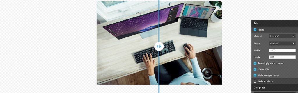
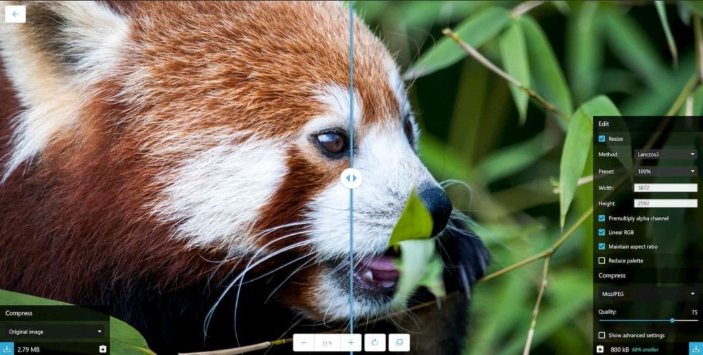
You can quickly resize or change the format of your image using a wide range of tools however my favourite is Squoosh. Squoosh has a great mix of advanced and basic features, it’s web-based, it’s free and also very simple to use.
To begin with, you just drag and drop your image into the Squoosh tab and from there you can start to adjust basic things such as the image dimensions in the Edit tab. A great feature is the slider which shows you how your adjustments have changed the quality of the image, for example, if you half the width and height of your image you can clearly see a reduction in quality on the right-hand slide of the slider while the left-hand side shows the original. Another helpful feature is the file size estimate on the right-hand side which tells you how your changes have affected the file size and how much smaller it is compared to the original file. This makes it very easy to target a maximum size of 100kb for your image.
Below the edit tab, there is the Compress section and this allows you to choose how much you want to compress the image on a sliding scale of 1-100. This defaults to 75 and this is probably as high as you want to go because if you go any higher you’re unlikely to notice the improvement in image quality but the file size increases significantly. I usually choose something between 50-75 depending on the image.
There is also an advanced section for those who really want to optimise every aspect of their image. However, the only reason I ever use it personally is to convert an image from colour to Greyscale to save a few more kb of file size compared to just applying a CSS filter.
Once you’re happy with the dimensions of the image and the amount of compression applied to it it’s then time to choose your image format. There are a couple of options for JPEGs and PNGs however you want to stick to the MozJPEG or OxiPNG format as these will provide much smaller file sizes at the same quality compared to browser JPEG/PNGs. Once you’ve chosen your file format just click the download button and your compressed image will be downloaded ready for you to add to your website. They also have support for WEBP and AVIF images however as they haven’t got 100% support I would avoid these formats for the time being. If you have the developer resource or you’re happy playing around with your own site you can make your website serve WEBP and AVIF images to browsers that support it and fall back to JPEG for those that don’t but this is probably outside the realm of your average website.
Quick Tips
- Make sure the image is the correct dimensions for where it’s being used on the site, there’s no point using a 6000x4000px image if it’s only being displayed at 1200x800.
- Make sure the image is in the correct format. This will usually be a JPEG apart from logos which may be PNGs or better yet SVGs.
- Make sure to compress your images even after exporting from a program like Photoshop. I have noticed that even if you save an image for web in Photoshop the file size can still be reduced by a large amount simply by dragging it into Squoosh and downloading it again without touching the settings.
- Make multiple dimensions of the image if you need it. If you’re using the same image in a hero section on one part of your website and then reusing in a post one of those images is either going to be too large or pixilated. By creating two dimensions of the same image your hero image will look crisp and sharp while the image in your post won’t be oversized.
Step By Step Process
1. Decide where your image will sit on your site
Will your image be a large hero image, an image inside a post or an icon?
2. Choose an appropriate image size
Now you know where the image will sit on your site you can now decide what size it needs to be. A hero image will likely need to be quite big so that it doesn’t look fuzzy and pixelated on a desktop. An image inside your post can be much smaller as it sits within your post and doesn’t take up a large portion of the screen. An icon will be some of the smallest images as they take up the smallest portion of the screen.
3. Drag and drop your image into Squoosh
Drag and drop your image into the Squoosh tool so you can start to resize your image to the correct dimensions.
4. Choose an appropriate image format
Now you know what size your image needs to be you then need to pick an appropriate format to download your image in. If it’s an icon, basic logo or illustration an SVG will be the best format due to it’s small file size and it’s ability to be enlarged without losing any quality. If it’s a more complex illustration then a PNG will be the best format as it will retain it’s quality however the final file size will be slightly larger. For the photography style images a JPEG will be best due to it’s file size compared to a PNG.
5. Download your compressed image
Download your image from Squoosh and upload it to your website.
If you need help optimising your images on your website or you’re looking to improve your site speed in general then pop me a message on the contact form and I’ll be happy to help you improve your site speed.

Similar Posts
How To Create An HTML Accordion